Dojo

Supercharging the high street for business and consumers
Opportunity
Payments provider Dojo reached out to DesignStudio at a pivotal point in their journey. Starting out as payments tech for small to medium size retailers and businesses, Dojo had seen significant growth into new global markets with a focus on larger enterprise businesses. This, combined with the recent acquisition of queuing app ‘Walk Up’, meant Dojo needed a compelling new brand identity to support their unique positioning and resonate with both B2C and B2B audiences.
Our approach was highly collaborative, working closely with the Dojo team across a number of workshops to define a truth that united both audiences. Ultimately, Dojo’s role, for both merchants and end customers, is to streamline the process of getting to the desired end experience.

Brand Strategy
This led to our brand idea, ‘Get to the good stuff’. Whether a business or a customer, Dojo’s easy payments and bookings means anyone can get to where they want, quicker. For businesses, that’s making seating, serving and settling up more efficient, so they can free up time to engage with customers face-to-face and ultimately increase revenue. For customers, that’s avoiding the hassle of planning and paying, so they can focus on their experience dining, shopping, drinking and more. By building meaning for merchants and customers, the idea positions Dojo in the driving seat of ‘the experience economy’.

Brand Expression
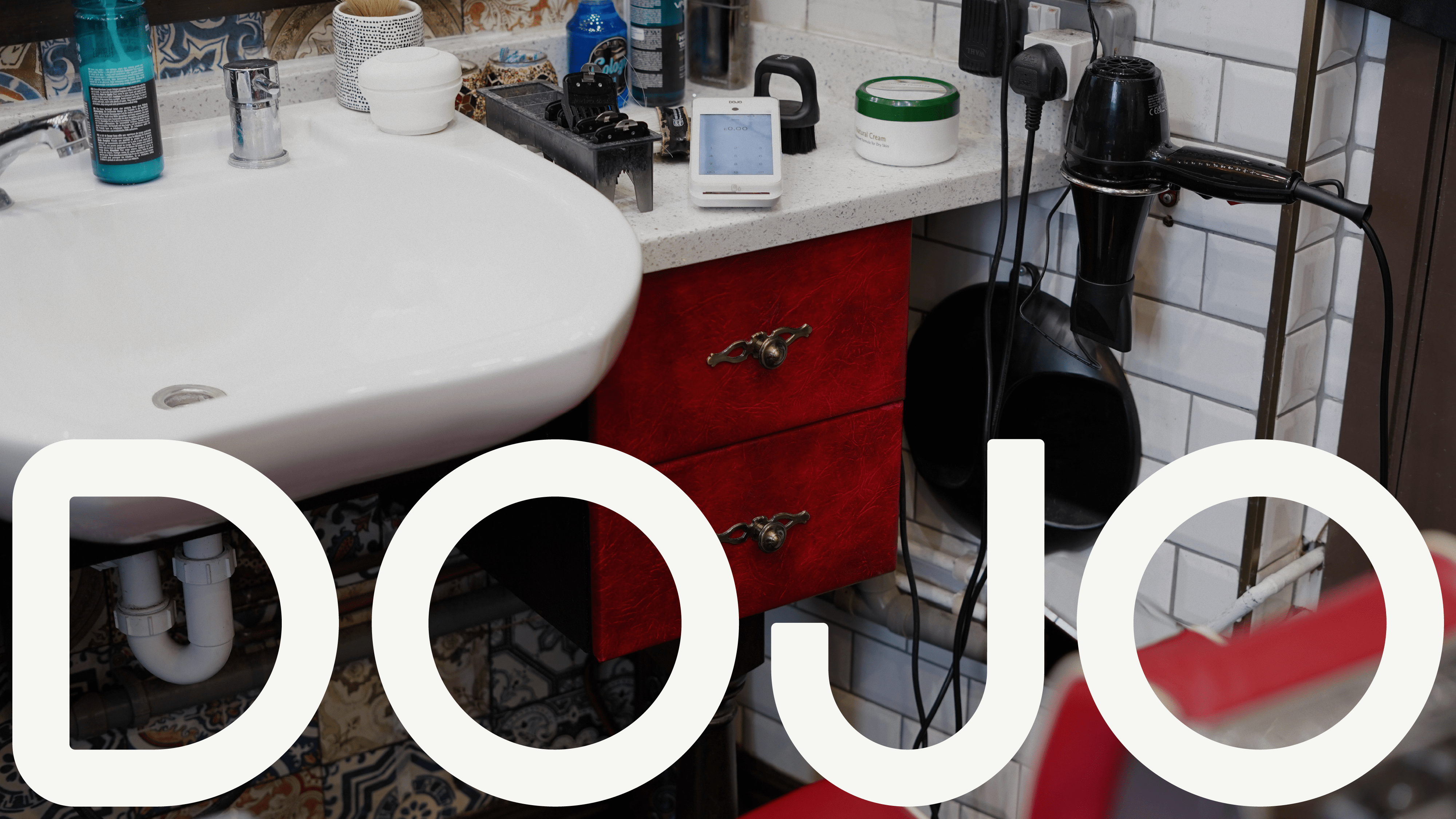
‘Get to the good stuff’ sits at the heart of the brand, and is brought to life through a dynamic graphic system. This new expression begins with a refreshed wordmark built from simple graphic forms that build with momentum, symbolising the movement and anticipation felt by both businesses and consumers.
The same sense of momentum is captured in Dojo Sans, a bespoke typeface created with Displaay Type Foundry. This typeface features a set of expressive glyphs that stretch and reform with rounded graphic forms and bold geometric details that feel strong and defined, yet open and approachable

The primary colour, Active Teal, elevates the heritage hue of Dojo into a fresher space, alluding to the ‘green light’ to go out, do business, and enjoy the high-street.
Art direction captures a day-in-the-life of business owners and the people they serve, keeping it real and in the moment. Bringing the defined photography principles and style direction to life, the Dojo team worked on an extensive shoot across multple locations around the UK.

Tone and Messaging
The visual identity works hard alongside an extensive tone of voice and messaging framework. Positive and feel good, Dojo is all about getting businesses and customers excited about their experience. Its balance of clarity and expressiveness can flex depending on the audience and application. A huge part of the brand identity, the ‘Get to the good stuff’ idea can be felt and heard wherever you are in the user journey creating a bold and memorable personality packed with energy and flavour.
.png)

A bespoke illustration set created with the Dojo team and Giacomo Bagnara compliments the forms from the logo and typeface. This creates a bold, simple and iconic visual identity that can dial up and down at different moments within the experience, across both marketing and digital touchpoints.


A Collaborative Spirit
Setting the vision for the creative delivery of the brand across all touchpoints through guidelines, brand launch and delivery support and workshops, DesignStudio also worked closely with Dojo to ensure the visual and verbal identity worked seamlessly through digital and product applications.


Special thanks
Client
Dojo Brand & Product Team
DesignStudio
Jordan Sheldrick Devine
Charlotte Francis
Leah Ratcliffe
Esme Pryor
Joni Kirton
Helly Blyth
Rosh Kumar
Hayden Shields
Connor Bannister
Sinead Kirby
Maddy Patterson
Alexa Turnpenney
Lesley Gundy
Cheryl Li
TJ Rees
Collaborators
Displaay Type Foundry
UsTwo
Giacomo Bagnara
